Data Visualization in R
Create stunning graphics for your Data Science projects


Create stunning graphics for your Data Science projects
A fun, hands-on, and project-based workshop that help students gain full proficiency in data visualization systems and tools. Create compelling narratives by combining charting elements with custom aesthetics under the guidance of our instructors.
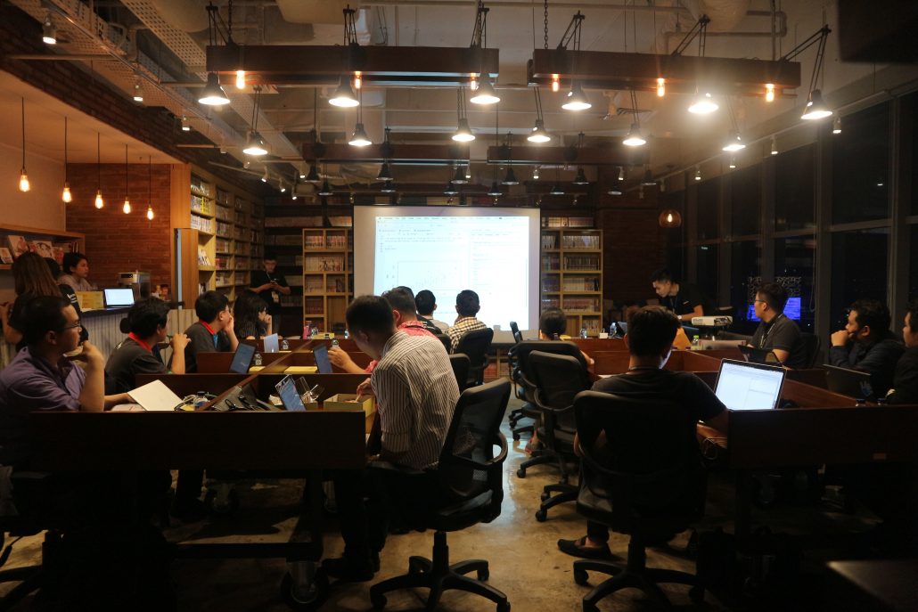
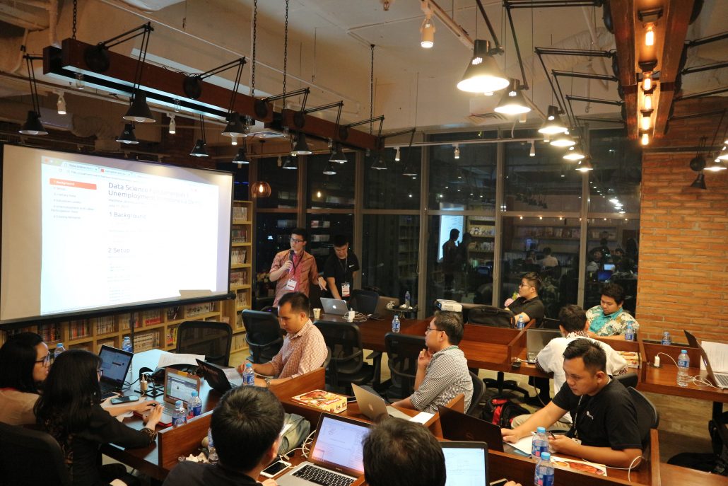
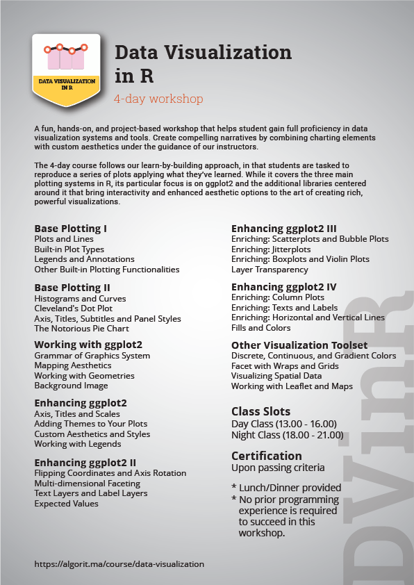
The 4-day course follows our learn-by-building approach, in that students are tasked to reproduce a series of plots applying what they’ve learned. While it covers the three main plotting systems in R, its particular focus is on ggplot2 and the additional libraries centered around it that brings interactivity and enhanced aesthetic options to the art of creating rich, powerful visualizations.

An RStudio-certified instructor and machine learning practitioner in the field of marketing automation, fraud detection, finance and e-commerce. Samuel is Indonesia’s top-ranked Stack Overflow user in R (top 5% worldwide) for three years running, and boasts certifications from RStudio, Microsoft, MongoDB, Neo4J Database, Stanford University, John Hopkins University, among others.
Prior to Algoritma, he has 8 years of working experience, including a stint as in-house consultant to several public-trading companies from his time staying in China, Japan and Singapore. He is today an active trainer and consultant for various companies in the financial industry. He has guest lectured in various campuses: Binus, NUS (National University of Singapore)’s The Logistics Institute, University of Indonesia, Universitas Gadjah Mada (UGM), Binus, Institute of Technology Bandung (ITB), Telkom University etc. Courses he authored are offered also in Singapore through Ngee Ann Polytechnic.
Samuel is also among the first recipients of Microsoft Professional Program Certificate in Data Science in Southeast Asia, having demonstrated proficiency in R, Python, Microsoft Azure, SQL / T-SQL, PowerBI and a list of other technologies, and among the first to be certified in RStudio’s program. Technical committee member and competition judge on Finhacks 2018, the largest Machine Learning competition of the year organized by PT. Bank Central Asia (BCA) and DailySocial.
Syllabus: Data Visualization in R
Creating a Publication-Grade Plot
Creating an Interactive Map
The Programming for Data Science workshop is designed for casual learners, working professionals and non-programmers that are taking their first steps into data science and machine learning.
Students are not assumed to have a working knowledge of R or prior proficiency in statistics / mathematics / algebra. At such the workshop follows a gentle learning curve and emphasize on hands-on, one-to-one tutoring from our team of instructors and teaching assistants.
Consider taking our Intermediate-level workshops instead for more advanced-level materials in statistical programming and machine learning.
Students work through tons of real-life examples using sample datasets donated by our team of mentors and corporate partners. We believe in a learn-by-building approach, and we employ instructors who are uncompromisingly passionate about your growth and education.

This workshop is part of the Data Visualization specialization track offered by Algoritma Data Science Academy. Participants are rewarded with a certificate of completion upon passing criteria, and are encouraged to advance further in the respective data science specialization.
PT. Algoritma Data Indonesia.
RDTX Square, 9th Floor. Setiabudi, DKI Jakarta 12930.
Office: 0816-692-471
Email: community@algorit.ma